"The amazing finding of the present study is that we do not observe global warming in the period 1982-2006, but significant cooling."
Source: Andries Rosema, Steven Foppes, Joost van der Woerd
Surface temperature as in 'temperature of the surface' is not what is routinely measured or referred to in meteorology. Surface temperature in meteorological observations usually refers to air temperature close to the ground, usually around 5 feet (1.25 to 2.0 metres) above the surface - the height at which weather stations are meant to take this measurement.
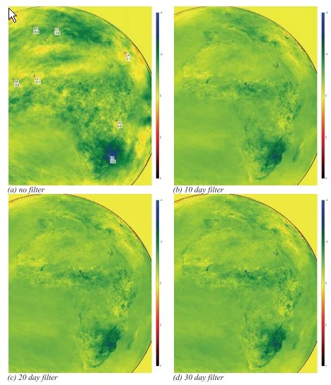
But what of the actual surface temperature? This is tricky to measure given the wide variety of surfaces, and the lack of any convention as to depth. But a geostationary satellite can take a broad view, in the case of Meteosat this mainly has a 5km resolution for temperature estimates. Looking down from above, that level of coarseness will help reduce the variation that would be expected at finer scales.
In their study published this year in the journal Energy & Environment, the three authors report how they took 25 years worth of satellite imagery from Meteosat from noon and midnight each day, and extracted estimates of surface temperatures from them. They used infra-red wavelengths for which the atmosphere is largely transparent in cloudless skies. But of course, there is always cloud to be seen in any hemisphere image. Their method to reduce the effect of clouds was to look at successive time periods (of 10, 20, and 30 days) and choose the highest temperature found (the 'brightest pixel') within each period. The hope is that that is likely to be from a relatively cloud-free day since cloud tops are much cooler than the surface.
There are other adjustment and computations to be made as described in the paper, but the authors seem reasonably confident that their results are sensible. They provide subsets of their data plotted as time-series for typical and atypical locations, and find the results plausible in each case.
There are no equivalent ground-based measurements to provide a cross-check for these results, but perhaps it may be possible to construct estimates of what they might be for simpler locations, e.g. sea areas.
These results will hopefully be subjected to considerable scrutiny and review, but I report them here at this stage simply as an illustration of 'unsettled science'. We have here results which on the face of it contradict the claims of relentless warming pushed by such as James Hansen in the late 1980s, including at the infamous hearing of 1988 in Washington. So many people have subsequently picked up on such claims and treated them as gospel that we are today in a very unsatisfactory position of having zealots for alarm poisoning discourse in this area, be it political or be it scientific discourse. Good teaching should help pupils step back from this unedifying spectacle, and form calmer and more considered opinions of what is going on.
Hat-tip: Greenie Watch which provides a link to this article on the above paper.
Note added a few hours after posting Some recent comments on this paper can be found here: http://objectivistindividualist.blogspot.co.uk/2013/08/earth-surface-cooled-from-1982-to-2006.html
Note added 09 August 2013 Project for the reader. The site CO2 Science provides a temperature plotter which can be used to look at temperatures attributed to zones 5deg (lat, long) on the side. It might be interesting to see how these computed mean surface air temperatures plots compare with those for specific locations provided in the paper over the same time periods.

No comments:
Post a Comment