Unfortunately, some misuse science. Some of their intentions, are far from benevolent. They see science as a mechanism for political power and control. There is great danger from those who would use science for political control over us.

How do they do this? They instill, and then continuously magnify, fear. Fear is the most effective instrument of totalitarian control.

Chet Richards, physicist,

https://www.americanthinker.com/articles/2021/03/science_in_an_age_of_fear.html

Wednesday, 21 August 2013

Conversation Pieces for the Climate Classroom Wall

Dramatically rising sea level is one of the Big Scares pushed at children to get them suitably conditioned about the C in CAGW (catastrophic anthropogenic global warming).  The cause is of course put down to the presumed dramatic effects of rising CO2 levels in the 2nd half of the 20th century, and their continued rise expected in the 21st.

These rises are held, by some, to be causing extraordinary rises in global mean temperature, as repeatedly implied for example by the IPCC's extensive use of the notorious Hockey Stick Plot in and around their 2001 AR3 report.   (For details of the sloppy nature of the work that produced this plot, and of the conniving that brought it to prominence, see 'The Hockey Stick Illusion'.)

But today, let us look at two other graphics recently highlighted at WUWT that could encourage both children and adults to develop a calmer perspective on climate change, and to be more more alert to the grossly irresponsible scaremongering that can be so readily found in this area.

(1) Our first graphic is a teaser. There was an overall rise in estimated global mean temperature in the 20th century, but the rising phase in the first half was remarkably similar in size and duration to that in the second half.  Cutting and pasting these phases to show them side by side on the same scale makes this quite clear, and is shown below.  In one we are told that 'natural causes' can account for the rise.  In the other we are told that only rising CO2 levels can explain it.  The observer is invited to guess which one is which:

Source: this graphic is presented here: http://wattsupwiththat.com/2013/08/20/when-somebody-hits-you-with-that-new-ipcc-is-95-certain-talking-point-show-them-this/#more-91971 . (The C3 site also has many relevant plots, including one used in an earlier post on Climate Lessons.) (Note added 18 Sep 2013: the graphic is due to Richard Lindzen, Journal of American Physicians and Surgeons Volume 18 Number 3 Fall 2013)

(2) Our second graphic is also a teaser, but of a different kind.  The observer is invited to speculate as to the intentions of those who prepared it and of those who authorised it for use on the cover of the September 2013 issue of National Geographic magazine.  What were they thinking?  Do they want to frighten us by any chance?  Do they presume we are innumerate?  Do they think that most of us will fail to check it out?  Was it a grossly irresponsible action on their part to publish it?  What kind of standards do they have?  And so on:


Anthony Watts estimates the water height shown is about 214 feet above mean sea level.  There is a sea-level measuring station nearby showing that sea level there has been rising at a pretty steady 0.0091 feet per year over the last 150 years or so:
Source: NOAA

He drily notes that at that rate, it will take about 23,500 years to reach the water height shown. 

But what about projected rates for the oceans overall?  What does the IPCC say?   Their projections from the AR4 report in 2007 show between 20cm and 50cm rise in the 21stC.  Let us once again do a naive projection of that into the future to see what kind of time we'd have to wait before the waters were reaching towards the waistline of the statue: 2,720 to 1,090 years if the local sea level there changed at those global rates..

Sea level is a surprisingly difficult thing to define and measure, but one thing is clear - we are not competent to forecast reliably its behaviour over anything like these timescales of a thousand years or more.   One recent study by one of the world's leading experts suggests that 'Best estimates for future sea level changes up to the year 2100 are in the range of +5 cm ±15 cm.'  Note well that this range includes both zero, and sea level decreases.  He is not sure that there will even be a rise.

The National Geographic cover is therefore nothing but an extremely wild, and extremely implausible speculation.  As Watts notes at the end of his post on this:

'It is this sort of junk science sensationalism that causes me and many others not to subscribe to National Geographic anymore. '

Teachers everywhere should be on the lookout for such 'junk science sensationalism' in the teaching materials they are being asked to use on climate.  Please also consider sending me details of any examples that you find if you would like them to be recorded here.

Note added 22 August 2013.  The NoTricksZone blog notes the ignorance and stupidity of the National Geographic cover, and recalls Der Spiegel doing something similar 27 years ago.They note that since then, some sense has got through to the editors of that magazine: 'Spiegel has long since cranked back its global warming alarmism, and even occasionally publishes articles critical of climate alarmism claiming even 1 meter of sea level rise by 2100.'

Note added 25 September 2013.  Don Easterbrook has examined more assertions in the despicable article behind that despicable picture in the National Geographic.  He concludes 'Summary of conclusions: From the evidence presented above, the obvious conclusion is that the National Geographic article is an absurd fairytale, completely unsupported by any real scientific data and directly contrary to a mountain of contrary evidence.' http://wattsupwiththat.com/2013/09/25/national-geographic-rising-sea-level-prophecycause-for-concern-or-absurd-fairytale/

Saturday, 17 August 2013

Green Bullies: frightening children is what they do

Is there any precedent for the childhood sacrifice being imposed on children by green fanatics?  Some are intent on spreading depression and dismay on to them while they are still at school.  Not only do they mislead them about the state of the world and of science, they also spread alarm.  If they are successful, this is what they will produce: ill-informed,  frightened children with dismal views of the future.  Ideal supporters-to-be for green causes on the one hand, but damaged victims of hyperbole and facile scaremongering on the other.


Here is a recent example from Australia (hat-tip Spiel Climate): 


Extract from this article by Tony Thomas (bold added):
---------------------------------------------------------------------------------------
'The best alarmist entry won $20,000 for Melbourne Girls College for school environmental projects, and the student won a $5000 study grant. The second prize was $12,500/$2500, to MLC, and the third prize of $8500/$1500 went to to Laverton P-12 College.
I do not, of course, begrudge the students their prizes for their talented art efforts. My complaints concern their elders, who see nothing wrong in indoctrinating kids with CO2 doomsterism. Student entrants were required to do an artwork on The Impact of Ocean Acidification and pen 100-word essays about their “inspiration”. It’s vicious, however well-meant, to blight kids’ optimism, as The Alliance’s does with its slogan, “Imagine losing all this colour and life”
The idea that a student should objectively survey the scientific controversies on this topic was unthinkable. Imagine an entry headed: “Probably not much CO2 impact”. The desired apocalyptic tone is captured in these briefing notes from the Alliance:
“The world's leading marine scientists are warning us that our current rates of carbon emissions are making our oceans more acidic. This is happening so fast that it poses a serious threat to biodiversity and marine life.
“Left unchecked, Ocean Acidification could destroy all our coral reefs by as early as 2050. It also has the potential to disrupt other ocean ecosystems, fisheries, habitats, and even entire oceanic food chains.,,
There are approximately 10,000 Coral Reefs and we are destroying one every other day...Left unchecked Ocean Acidification could trigger a Great Mass Extinction Event...
Greenhouse Gas Emissions must be cut dramatically by 2050 if Coral Reefs are to have any chance of surviving the next 50 years...”  '
---------------------------------------------------------------------------------------

The reality of course is that the oceans are alkaline, and will remain so even under the projected and imagined impacts.  The terminology of 'acidification' no doubt delights the propagandists because it has more scary overtones than talking about reductions in alkalinity.   But like the even more misleading term 'greenhouse effect', the use of 'acidification' is also widely used in scientific literature and is not likely to be replaced any time soon.


To get an idea of the one-sided view promoted for this brainwashing exercise, one can visit the invaluable CO2 Science website and its Subject Index.  There are many relevant entries under Ocean Acidification,  and under Calcification (Corals), all to research published in the science literature.  Let me reproduce some extracts here merely to make the point that it is by no means established that rising CO2 levels are a serious threat to marine life in general and corals in particular:

(1)  Loaiciga, H.A. 2006. Modern-age buildup of CO2 and its effects on seawater acidity and salinity. Geophysical Research Letters 33: 10.1029/2006GL026305.
    ' Loaiciga concludes that "on a global scale and over the time scales considered (hundreds of years), there would not be accentuated changes in either seawater salinity or acidity from the rising concentration of atmospheric CO2." Hence, any changes that might occur would have little to no negative biological ramifications, as we have reported repeatedly in Journal Reviews archived under Coral Reefs (Calcification) in our Subject Index.'
(2) Pelejero, C., Calvo, E., McCulloch, M.T., Marshall, J.F., Gagan, M.K., Lough, J.M. and Opdyke, B.N.  2005.  Preindustrial to modern interdecadal variability in coral reef pH.  Science 309: 2204-2207.
   ' Contrary to climate-alarmist claims that historical anthropogenic CO2 emissions have already resulted in a significant decline in ocean water pH and aragonite saturation state, Pelejero et al.'s 300-year record of these parameters (which, in their words, began "well before the start of the Industrial Revolution") provides no evidence of such a decline.  In addition, and also contrary to what one would expect from climate-alarmist claims of how sensitive coral calcification rate is to changes in pH and aragonite saturation state, they found that huge cyclical changes in these parameters had essentially no detectable effect on either coral calcification or skeletal extension rates. '
(3) Ries, J.B., Cohen, A.L. and McCorkle, D.C. 2010. A nonlinear calcification response to CO2-induced ocean acidification by the coral Oculina arbusculaCoral Reefs 29: 661-674.
'The three researchers, in their words, "propose that the apparent insensitivity of calcification and linear extension within O. arbuscula to reductions in ΩA from 2.6 to 1.6 reflects the corals' ability to manipulate the carbonate chemistry at their site of calcification." And it would further appear that that ability should serve the corals well, no matter how much fossil fuel is burned before various non-CO2-producing forms of energy generation become sufficiently developed to supply the bulk of the world's energy needs.'

This glimpse into the complexities of the science serves to highlight just how irresponsible and malevolent is the singling-out and promotion to children of exclusively alarmist claims in this area.  

Note added 18 Sep 2013.  Tony Thomas has written several other penetrating articles on climate matters.  See: http://tthomas061.wordpress.com/category/climate-unfrocked/

Tuesday, 13 August 2013

The Augean Stables of Climate Materials for Schools - an example from the teaching of English language in Germany

So many people have been duped by climate dogma which insists on catastrophic effects from rising CO2 that signs of it appear in all sorts of places.  It can of course be found in geography and popular science books for children, and in many websites, but it can also be found in language lessons.  I myself came across it while studying French.  Here is an example from a textbook used for teaching English in high schools in Germany, well-annotated by critical observers from the policy think-tank KE Research:


Their conclusions are: 

# “Greenhouse gases” and clouds continuously radiate energy into outer space. Thereby they cool the atmosphere. This enables the atmosphere to cool the ground. This has been going on over billions of years.

#  Since IR active gases cool the Earth (at least indirectly), an increase in their concentration cannot cause a raise of temperatures. This constitutes a disproof of the CO2 warming hypothesis (yellow block in the “Green Tower” in fig. 1).

# All further claims of the climate dogma (computerized climate prophecy, apocalyptic consequences, need of political action and “climate protection”) would only make sense if the CO2 warming hypothesis is proven. But as the hypothesis is demonstrated invalid by our comparison with the Moon, the claims derived from it as well as the actions suggested make no sense. The entire CO2-based “climate research” proves to be pseudo science – or charlatanism.

# In certain countries, public education is misused by governments to implant fears in the brains of students – being the result of a wrongly built understanding of nature.


This is right at the heart of the debate, or rather it ought to be.  Instead these are amongst the so-called ‘sceptical’ views that are often ridiculed or ignored.  But the basic assertion that radiation in infra-red from the atmosphere to space is an important component of Earth’s cooling mechanism is correct.  Their second point is far more contentious.  It is not clear to me what the overall, or net effect of CO2 in the climate system is.  I can also go along with a modest warming contribution of CO2 thanks to it delaying heat loss from the surface to space by absorbing Earth radiation (in the relevant narrow bands for CO2) before re-emitting it in all directions.  Simple calculations suggest a value of the order of 1C for this warming for every doubling of ambient CO2 levels.  One day, perhaps we shall see computer modelling of CO2 in the climate system.  We do not have that at present.  Instead the GCMs have proven to be a rather expensive way of confirming that when you suppress heat loss from an exernally heated object, that object’s temperature will, all else being equal, rise.  This is done in the models by imposing an instantaneous drop in radiative heat loss at the outer edge of the atmosphere for a given increase in ambient CO2.  This paper by KE Research is one which suggests that the role of CO2 is more complicated than that.  The current GCMs cannot help resolve this since they work from a presumed net effect of CO2, i.e. they incorporate a conclusion rather than discover it from the model runs.

There is also a recent post by Roy Spencer, with discussion in the comments on the same topic: http://www.drroyspencer.com/2013/08/does-a-greenhouse-operate-through-the-greenhouse-effect/

The extract from the paper does not show up very clearly in the image above, so here is a higher-definition version just of the textbook page:

Monday, 12 August 2013

Climate Control Freakery: a disturbed academic in Australia has his sights on the children

Writing on the Wall, or just the zealotry of someone disturbed out of all proportion by the talk of climate catastrophe?  It is shocking to note that this man is a lecturer in a university.  Here is what he has in mind for children:

5. Children
Hundreds of millions of children are already the victims of the worsening climate crisis and it is estimated that 6 billion under-5 year old infants will die avoidably this century due to unaddressed climate change. All children are acutely threatened by man-made climate change. Some ideas for climate action re children:
5.1 Carefully-designed, ethical, science-informed (e.g. Climate Commission-informed), clear summaries of the climate crisis and solutions should be provided to all primary school children as a booklet, book mark, and refrigerator magnet.
5.2 Carefully-designed, ethical, science-informed, clear summaries of the climate crisis and solutions should be provided to all secondary school children as a booklet, book mark, and refrigerator magnet.
5.3 Green apparel as a badge of environmental concern (children can declare themselves for their future; make every day St Patrick’s Day).
5.4 Carefully-designed, ethical, science-informed, clear summaries of the climate crisis and solutions should be provided to all parents, school teachers, clergy, sports coaches, music teachers and indeed all those involved with children activities.
5.5 Smart ways of explaining to children that we have just One Planet and that any species extinction is unacceptable.
5.6 Awards to children (from badges to books) for good works for the Biosphere.
5.7. Local, state, national and global awards for outstanding environmentalism by children.
5.8 Children must be ethically encouraged to boycott ecocidal and terracidal products and services.
5.9 Children should be ethically encouraged to ask what their elders are doing in the War on the Planet. and instructed about the terms intergenerational equity, intergenerational justice, intergenerational inequity and intergenerational injustice.
5.10 Climate activists must educate and mobilize children who have the time and energy to help save their world.
5.11 Children and young people in general instructed about intergenerational equity, intergenerational justice, intergenerational inequity and intergenerational injustice.
5.12 Just as a children were ethically instructed about the consequences of nuclear war in “When the wind blows” by Raymond Briggs (1982), so they should be similarly made aware of the consequences of climate change inaction


Perhaps if someone pointed out to him that there is no sign of a 'climate crisis' anywhere, let alone of 'the worsening climate crisis', it might help him understand that the crisis projected as a possibility by such as the IPCC is not due to arrive for many more decades.  Their alarm is based upon crude and inadequate computer models which have enjoyed a dismal track record to date, and which show little sign of real improvement despite the billions of dollars thrown at and around them for the past 20 years or more.

So far, this century and last, the climate has done nothing extraordinary.   But we have seen some extraordinary actions proposed for the control and manipulation of society.  Such as the above.

Hat-tip: Greenie Watch: http://antigreen.blogspot.co.uk/2013/08/dotty-warmist-aiming-for-minds-of.html#links

PS It would make a good exercise for senior pupils to Fisk or otherwise comment on the implications of each point.

Wednesday, 7 August 2013

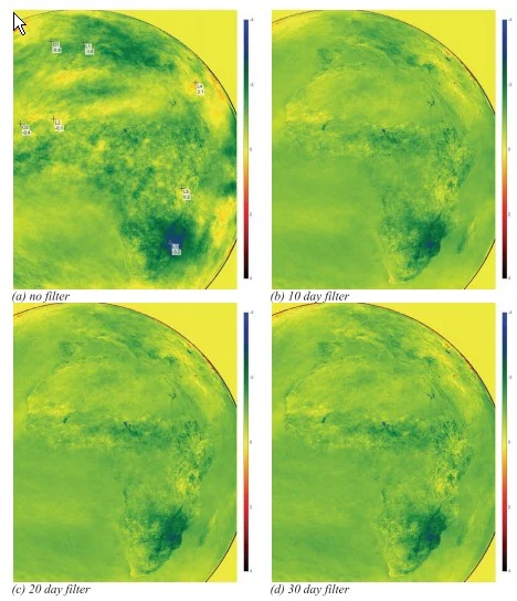
Satellite graphics show the Earth's surface cooling during the years 1982 to 2006

"The amazing finding of the present study is that we do not observe global warming in the period 1982-2006, but significant cooling."
Source: Andries Rosema, Steven Foppes, Joost van der Woerd

Surface temperature as in 'temperature of the surface' is not what is routinely measured or referred to in meteorology.  Surface temperature in meteorological observations usually refers to air temperature close to the ground, usually around 5 feet (1.25 to 2.0 metres) above the surface - the height at which weather stations are meant to take this measurement.

But what of the actual surface temperature?  This is tricky to measure given the wide variety of surfaces, and the lack of any convention as to depth.  But a geostationary satellite can take a broad view, in the case of Meteosat this mainly has a 5km resolution for temperature estimates.  Looking down from above, that level of coarseness will help reduce the variation that would be expected at finer scales.

In their study published this year in the journal Energy & Environment, the three authors report how they took 25 years worth of satellite imagery from Meteosat from noon and midnight each day, and extracted estimates of surface temperatures from them.  They used infra-red wavelengths for which the atmosphere is largely transparent in cloudless skies.  But of course, there is always cloud to be seen in any hemisphere image.  Their method to reduce the effect of clouds was to look at successive time periods (of 10, 20, and 30 days) and choose the highest temperature found (the 'brightest pixel') within each period.  The hope is that that is likely to be from a relatively cloud-free day since cloud tops are much cooler than the surface.
There are other adjustment and computations to be made as described in the paper, but the authors seem reasonably confident that their results are sensible.  They provide subsets of their data plotted as time-series for typical and atypical locations, and find the results plausible in each case.

There are no equivalent ground-based measurements to provide a cross-check for these results, but perhaps it may be possible to construct estimates of what they might be for simpler locations, e.g. sea areas.

These results will hopefully be subjected to considerable scrutiny and review, but I report them here at this stage simply as an illustration of 'unsettled science'.  We have here results which on the face of it contradict the claims of relentless warming pushed by such as James Hansen in the late 1980s, including at the infamous hearing of 1988 in Washington.  So many people have subsequently picked up on such claims and treated them as gospel that we are today in a very unsatisfactory position of having zealots for alarm poisoning discourse in this area, be it political or be it scientific discourse.  Good teaching should help pupils step back from this unedifying spectacle, and form calmer and more considered opinions of what is going on.

Hat-tip: Greenie Watch which provides a link to this article on the above paper.

Note added a few hours after posting  Some recent comments on this paper can be found here: http://objectivistindividualist.blogspot.co.uk/2013/08/earth-surface-cooled-from-1982-to-2006.html
Note added 09 August 2013  Project for the reader.  The site CO2 Science provides a temperature plotter which can be used to look at temperatures attributed to zones 5deg (lat, long) on the side.  It might be interesting to see how these computed mean surface air temperatures plots compare with those for specific locations provided in the paper over the same time periods.

Tuesday, 6 August 2013

Ten-minute trainer: a case against the establishment case for alarm over CO2

For teachers with 30 minutes to spare, and a suitable class (perhaps one whose important exams in this area have been completed successfully), here is a brief YouTube clip which does a cool, calm, and collected job of undermining the case for alarm over CO2 - a case which may be taken for granted in your curricula.  He is particularly critical of the 'positive feedbacks' which are a crucial part of the case for alarm:


This is a short video of about 13 minutes (no 10-minute trainer takes exactly 10 minutes!) linked to at the NoTricksZone which notes it was linked to in a tweet by Tallbloke.

The video is the work of David Evans in Australia. More details of his case can be found here:

and he has also produced some very good, but longer videos here: http://joannenova.com.au/2012/04/david-evans-explains-the-skeptics-case-youtube/


Some minor points. 
(1)   The claim that positive water-vapour driven feedback is ‘assumed’ in the models is not quite correct.  What they assume is that global relative humidity stays constant as temperature rises.  This necessarily means water vapour levels will increase in the models, and this is what is believed to lead to the positive feedback that appears in them.  In practice, there is some evidence that relative humidity has been decreasing in recent decades. 


(2)    The first graphic in the short video shows ‘observed temperature increase’ as the output of models.  If it was in fact the observed temperature increase, then the models would be doing a perfect job on them.  Actually the output of models is ‘expected temperatures’, or 'predicted temperatures'.  When these are compared with observed temperatures, the discrepancies are obvious.